Where It Started
I thought the problem was simple
The ICCIT redesign began as a class project. At first, the problem felt obvious: students could not find information easily on the Institute of Communication, Culture, Information, and Technology homepage.
My early mental model was narrow. Improve student navigation. Clean up the structure. Make important links easier to find. Reduce confusion.
That was not wrong. It was just incomplete.
The First Shift
The homepage was not only for students
Current students were only one part of the system. The homepage also had to speak to prospective students, parents, professors, researchers, employers, opportunity-seekers, and visitors trying to understand what ICCIT even was.
The Real Problem
The information existed. The path to it did not.
The original homepage was not failing because the university lacked information. It was failing because people could not reach that information easily.
Important content was buried several pages deep. Navigation paths were unclear. Users got frustrated. The department received questions that were technically already answered somewhere on the website.
That distinction changed the redesign. The goal was not to add more. It was to make existing information easier to discover, understand, and trust.
Research Changed The Shape
The more users I spoke to, the less obvious the redesign became.
The research phase made the project messier in the right way. Contextual inquiry, participatory design, focus groups, usability testing, and task-based evaluation all pointed to the same larger lesson: different users were arriving with different anxieties.
Students wanted speed. Prospective students wanted clarity and identity. Parents wanted reassurance. Faculty needed representation and visibility. General visitors needed a plain-language explanation of what ICCIT was.
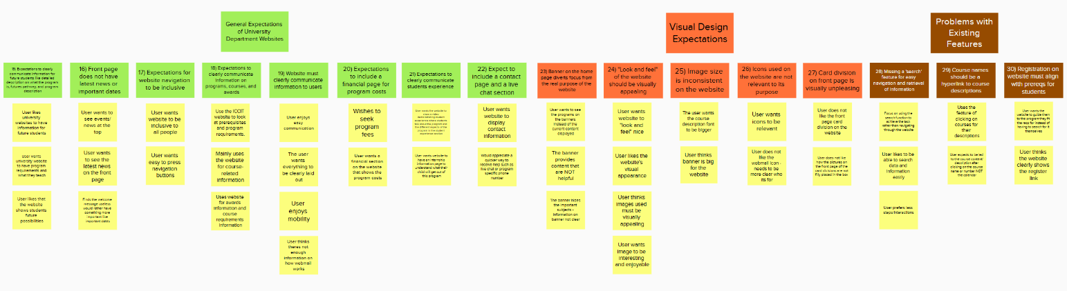
Miro / Mural Board
A short selection from the affinity diagram, showing how research inputs began clustering into expectations, visual issues, and existing feature problems.
View research and evaluation methods
- Contextual inquiry interviews to understand real navigation pain points.
- Participatory design sessions to bring users into early solution thinking.
- Focus groups to explore expectations, frustration, and priority conflicts.
- Usability testing on the older site to observe confusion points.
- Task-based evaluation, including whether users completed tasks successfully and how long they took.
- Additional interviews and fast-paced testing to refine the final direction.
The First Real UX Realization
UX was not just making the interface cleaner
This was one of the first times I realized UX was not just about making interfaces prettier. It was about balancing different realities inside the same system.
From Single User To System
Good UX is not giving everyone everything they want.
Not every user need could dominate the homepage equally. There was limited space, institutional branding, technical feasibility, time constraints, and University of Toronto design expectations.
I had to stop thinking in terms of perfect solutions and start thinking in terms of practical hierarchy.
Students
Needed quick routes to programs, courses, opportunities, and support.
Prospective students
Needed identity, clarity, and a sense of what ICCIT offered.
Parents
Needed reassurance, structure, and confidence that information was reliable.
Faculty and institution
Needed representation, accuracy, and alignment with official standards.
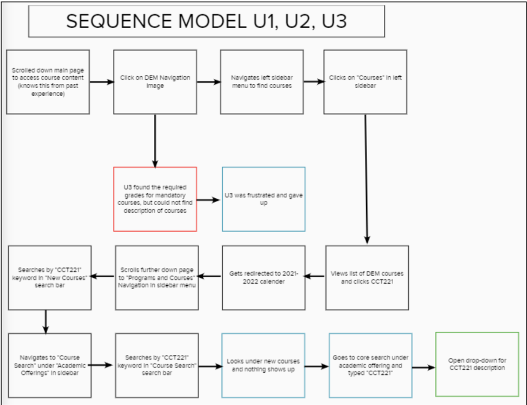
Sequence Model
The sequence model made friction visible by mapping how users moved through the site while trying to locate course information.
Tradeoffs
Designing the hierarchy
The redesign became less about decoration and more about deciding what deserved attention first. That meant prioritizing pathways instead of simply placing more information on the page.
Information architecture affects emotion. Users do not simply become confused. They become frustrated, uncertain, dependent on support, disconnected from the institution, and overwhelmed.
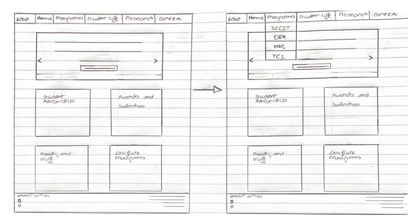
Semantic Model
A hand-drawn model exploring homepage structure, navigation, and how program information could be reorganized more clearly.
From Sketch To Prototype
The design had to communicate with implementers
The prototype was not built as a polished product demo for participants. It was built as an implementation-facing artifact for the university IT department.
That changed what the prototype needed to do. It had to communicate hierarchy, navigation, content structure, and intent clearly enough that someone else could adapt it within real institutional constraints.
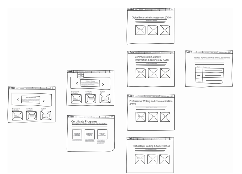
Wireframes
Low-fidelity wireframes explored homepage structure, program areas, certificate pages, and course information layouts before the final prototype direction.
Implementation Reality
Design does not end when the mockup is complete.
A real system still has to survive implementation: branding, technical feasibility, formatting standards, stakeholder expectations, and the limits of what can actually be maintained.
Outcome
A redesign direction, not a fantasy artifact
The project contributed to the redesign direction for the ICCIT homepage and was adapted within University of Toronto design and implementation constraints.
The final implementation differed slightly from the original design vision. That was not a failure. It was the reality of moving from prototype to institution.
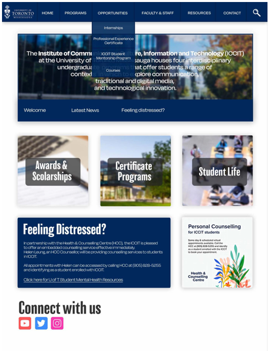
Prototype Screens
A static prototype screen used to communicate the redesign direction, homepage hierarchy, and implementation-facing layout decisions.
Testing
What still created friction
Task-based testing helped reveal where the redesign direction was working and where friction remained. Users could complete many navigation tasks, but program comparison still created difficulty.
That mattered because UX maturity is not pretending the design solved everything. It is knowing what got better, what remained hard, and what the next version needs to address.
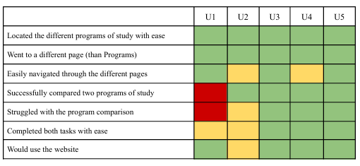
Testing Results
A task-based testing matrix showing where participants completed tasks with ease and where program comparison still created friction.
What I Learned
This is where UX became real to me
I began the project thinking mostly about interface problems. I left thinking about systems, stakeholders, hierarchy, institutional constraints, and implementation realities.
The biggest lesson was that UX is not just interfaces. It is people, systems, priorities, constraints, and communication.
Future Direction
Helping users navigate uncertainty
The next version of the experience would not simply organize information better. It would help users navigate uncertainty more intelligently.
That could mean more intelligent navigation, adaptive support systems, AI-assisted guidance, conversational navigation, and more personalized information discovery. Not to replace information architecture, but to support users when the structure alone is not enough.
The Messy Kitchen
The story above is the clean version. The artifacts are now placed throughout the narrative where they shaped the thinking: affinity work, sequence modeling, wireframes, prototype screens, and testing results.
Process Note
The most important artifact was not a single screen. It was the shift from interface thinking to stakeholder thinking.
Design Constraint
This was the core tension behind the homepage hierarchy.