Origin
I was not trying to build a product
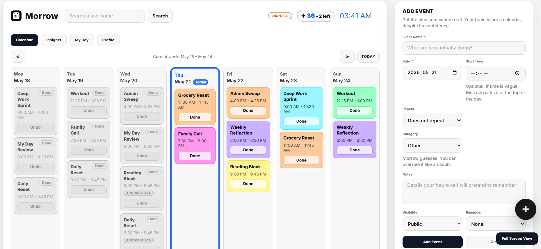
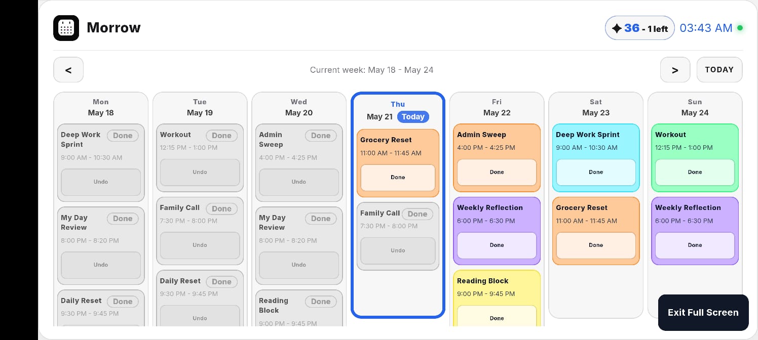
Morrow did not begin as a startup idea or a productivity system. It began as a personal calendar I wanted to live on a wall display.
I wanted something visible, calm, and alive in my room. Not another app hidden behind a phone screen. Something I could glance at and answer a simple question: am I actually free?
The earliest version was a weekly calendar with event scheduling, editing, deletion, categories, visual customization, and an RGB-inspired aesthetic. The goal was not productivity. The goal was visibility.
Wall-Display Thinking
The desktop calendar reflects the original idea: organization as something present in the environment, not buried inside a task app.
Guiding Question
How can technology help people create days worth remembering?
That question did not exist at the beginning. It emerged after many ideas, pivots, removals, and uncomfortable design decisions.
Product Evolution
The product changed because the question changed
Every major iteration forced me to ask whether Morrow was encouraging meaningful action or simply making another engaging interface.
1. Calendar
A visible weekly planner for scheduling, editing, categorizing, and customizing daily life.
2. Values
Categories such as education, work, leisure, social, personal, and prayer shifted the product from appointments to priorities.
3. Platform
Accounts, personal databases, themes, public/private modes, calendar integration, and cross-platform support turned a personal tool into a product question.
4. Memory
Summaries, archives, exports, and analytics changed the calendar from a future-facing tool into a reflection system.
5. Motivation
Streaks, recovery windows, and the garden tested persuasive design, then exposed where engagement could become misaligned.
6. Documentation
Photo capture and daily recap videos moved the product from completion tracking toward memory preservation.
Values Entered The System
Not all events were equal
The first calendar treated every event as a block of time. That started to feel wrong. A work task, a class, a social plan, leisure, personal care, and prayer do not carry the same meaning.
Adding categories made the calendar more values-aware. Prayer was especially important because it moved Morrow away from generic productivity and toward life design. It asked whether a calendar could reflect what someone values, not just what someone is busy with.
That led to automated prayer integration: location detection, automatic prayer times, daily prayer generation, and the ability to disable that support for non-Muslim users. This was the first time Morrow started to feel less like "my calendar" and more like a customizable platform.
Beyond One User
A personal system became a public product problem
Once I imagined other people using Morrow, the design changed immediately. A private calendar is simple until every user needs their own data, theme, name, calendar connections, privacy defaults, and recovery path.
This led to plans for user accounts, personal databases, public and private modes, Google Calendar integration, cross-platform support, and a progressive web app that could work across Android, iOS, desktop, home-screen installs, push notifications, and offline states.
Building products is not just adding features. It is accepting responsibility for what those features now require.
The Calendar Remembered
Traditional calendars forget the day as soon as it ends
The next major realization was simple: calendars are obsessed with the future. They help you plan what is coming, but once a day passes, it usually disappears.
That led to a new question: what if the calendar remembered?
Morrow began exploring weekly summaries, monthly summaries, yearly summaries, PDF exports, historical archives, category breakdowns, trend tracking, and personal analytics. The product became both a planning system and a memory system.
My Day Summary
Summaries shifted the product away from simply asking what was scheduled and toward asking what was worth remembering.
Persuasive Design
Streaks were useful, then suspicious
Because my HCI research focuses on deceptive design patterns, persuasive technology, and ethical design, I could not treat motivation as a neutral feature.
I explored streaks with complete days, incomplete days, grace periods, recovery windows, and growth streaks. I avoided punitive language. Instead of "failed days," the system used softer terms such as "incomplete" and "recovered."
The recovery system gave users a 24-hour window to complete activities late. It tried to balance accountability with compassion, because real people miss things. Real routines bend.
The Garden
The most ambitious feature was the one I removed
The garden was an attempt to make progress visible. Every user would receive a tree. Activities could influence growth, leaves, flowers, fruits, colors, species, and customization. Educational activities might make the tree greener. Physical activities might generate flowers.
It was a beautiful idea in theory. It represented care, consistency, and growth.
But the more I worked through it, the more the feature started to feel misaligned. The garden rewarded interaction with the app. It did not necessarily reward interaction with life.
The Pivot
I stopped asking how to reward people.
I started asking what people already cared about. That changed Morrow more than any single feature did.
Photo Documentation
Documentation became more powerful than gamification
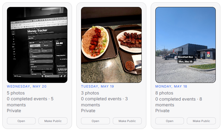
The breakthrough was photo documentation. Instead of marking an event complete, users could capture a photo from the coffee chat, lecture, workout, social gathering, or ordinary moment they wanted to remember.
The photo was not meant to be proof. It was meant to be memory creation.
This changed the product's emotional logic. The shift was no longer from incomplete to complete. It was from scheduled life to documented life.
In-App Camera
Authenticity became a design constraint
I explored requiring photos to be captured inside the app. Uploads are flexible, but they allow old photos, staged photos, and timeline manipulation. In-app capture encourages presence, authenticity, and living in the moment.
This was heavily inspired by Snapchat's design philosophy: the camera as a way of capturing now, not curating later.
The camera also became one of the hardest implementation and UX challenges because "take a picture" hides permissions, mobile device differences, front and rear cameras, multiple lenses, filters, capture flows, and upload behavior.

Camera Workflow
The camera flow turned authenticity into a product problem: how to support real moments without making capture feel heavy.
Daily Recap Videos
The reward became the memory
Once photo documentation existed, daily recap videos became the strongest feature direction. The flow was simple: schedule activities, complete them, capture photos, and generate a recap.
The recap video became reflection, reward, and memory artifact at the same time. It changed the motivational question from "Can I keep my streak?" to "What kind of day do I want to remember tonight?"
At that point, streaks became less central. The recap itself became the reward.
Social Sharing
The highlight reel problem
Once recap videos existed, sharing them became an obvious possibility. Sharing could support inspiration, accountability, exploration, and motivation.
It could also create FOMO, social comparison, exclusion, and another highlight-reel culture. People naturally share concerts, travel, social events, and celebrations. They rarely share ordinary days, rest, solitude, or quiet effort.
This remains one of the most important open design questions in Morrow: how can a platform encourage authentic reflection without becoming another Instagram?
Scheduled vs Lived Life
Meaningful moments do not always wait for the calendar
At first, every photo had to be tied to a scheduled event. Later, I questioned whether meaningful moments should require planning.
That distinction between scheduled life and lived life became increasingly important. A good memory system needs room for spontaneous moments, unplanned experiences, and ordinary days that matter only after they happen.
Mobile Planning
The mobile view supports quick planning, but the product direction increasingly had to make room for moments that were never scheduled at all.
Feature Cleanup
Some metrics made the product worse
As Morrow matured, I removed metrics such as done counters and recovery counters. They were easy to display, but they encouraged quantity over meaning.
A user with a busier schedule could appear more successful, even if the experiences were less meaningful. That was not the product I wanted to build.
Current Vision
Morrow is no longer simply a calendar
Morrow is currently a private experimental product. The core system works, but I am intentionally keeping it small while I continue testing the experience, cost structure, and long-term direction.
Today, Morrow is best described as a platform that helps people plan, document, reflect on, and remember their lives.
Planning
Helping people structure days before they happen.
Documentation
Capturing moments as lived evidence, not productivity proof.
Reflection
Turning days into summaries, recaps, and personal meaning.
Memory
Preserving ordinary and meaningful experiences before they disappear.
Analytics
Helping users understand time allocation without reducing life to numbers.
Intentional Living
Encouraging real-world action rather than more screen time.
What It Taught Me
The product changed because I changed my mind
Morrow taught me that persuasive systems can be ethical only when they remain accountable to the user's life, not the product's engagement goals.
It taught me that memories can be more motivating than streaks, documentation can be more meaningful than gamification, and reflection can be more valuable than another metric.
Most importantly, it taught me to abandon ideas I had invested in when they no longer aligned with the product's deeper purpose.
The Messy Kitchen
The clean story is the current product vision. The kitchen behind it is a trail of ideas that were tested, questioned, narrowed, removed, or transformed.
Killed Garden
A major feature was abandoned because it no longer matched the product philosophy.
Recovery System
The system tried to respect realistic human behavior instead of punishing missed days.
Removed Metrics
Feature cleanup helped Morrow move toward reflection and experience quality.
Open Ethical Question
The social layer is still being treated carefully because the risk is part of the design problem.